First thoughts on iOS14 and WatchOS7
As someone who's personal technology choices involve only Apple products, I'm pretty excited when the next major release arrives with new features. This release introduced new features that solved or deferred several major issues...at least for me. First, organizing apps manually is a mess, particularly for seldom used apps and utilities. Second, watch face stagnation.
iOS14 Thoughts
I have a pile of iPhone
apps that I use periodically. Apps like Southwest Airlines, PayPal, AllTrails
stay on my phone, but aren't every day, core apps. These are typically filed
into drawers and are buried until I need them. When I do need them, my workflow
to launch the app involves either a down-swipe to search for the app or random
swiping between screens and tapping in drawers until I find exactly where I
filed it. This is a suboptimal experience.
I should have taken a screenshot of my home screen before updating the approximation below shows a cluttered mess and multiple screens of partially organized apps.
 |
| messy iOS 13 screen |
After upgrading to iOS 14 screen, I was able to streamline my home screen significantly. As you can see from the screenshot below, the biggest change is the widget stack at the top which is currently displaying the weather. It's called a 'stack' because you can add multiple widgets and swipe up or down the cycle through them. My stack includes Weather, Activity, Podcasts, Music, News, and Calendar. The stack pushes down my core apps to a more reasonable tap distance which is nice benefit too. Other widgets are still available by the swipe-right gesture. I only have one screen, everything else gets dumped into the new App Library.
 |
| clean iOS 14 screen |
Apple seems to have understood the frustration of having a messy home screen and developed a feature called 'App Library'. This allows users to hide seldom used application into the library without cluttering up multiple screens or manually sorting applications into drawers. App icons in the library as resized so popular apps are larger than less used apps. Additionally, apps in the library are grouped by category automatically. The App Library also includes a search function present at the top to find apps that may not be immediately visible.
 |
| iOS 14 App Library |
WatchOS 7 Thoughts
My biggest complaint about the Apple Watch is lack of watch face customization. My first smartwatch was a Pebble Time and I LOVED the variety of watch faces. While the functionality of Apple Watch is much better, the lack of watch faces (and battery life) are a constant irritation. The price of functionality appears to be paid in dollars and the monotony that every Apple Watch wearer is stuck with the same dozen or so faces. But WatchOS 7 does give us 5 new faces to look at, which is ... something. I'm not going to review all the watch faces, but I will mention my favorites.
The GMT watch face displays an alternate hour hand (in red) which notes the time in a different time zone, the default is Greenwich Mean Time (hence the face name), but it can be adjusted to any time zone. Adjusting the time zone to the non-default adds a three-letter abbreviation for the time zone just under the 12-hour mark. The alternating circle notes AM or PM. I work with a team in India quite a bit, so it's helpful to be able to see what time it is there without having to use the tiny World Clock complications.
 |
| GMT watch face |
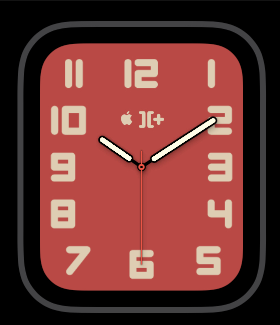
iOS has had the Utility and Simple faces for quite a while, but color combinations were limited. The Typograph seems to be a better option for those looking for more customization on a simpler watch face.
 |
| Typograph face config screen. |
I'm pleased with the font choices and the available color schemes. It's not the most flashy, but it's something different if you are tired of the California or Meridian faces (which I am). This is my current Typograph face, with an homage to my first Apple computer the II+.

Comments
Post a Comment